What's the Difference: True Autumn vs Dark Autumn

What’s the difference between True Autumn and Dark Autumn? It’s not as simple as “Dark Autumn is darker” or “True Autumn is warmer.” So far, we’ve only explored comparisons between neutral seasons - but here one is a true, and one is a neutral.


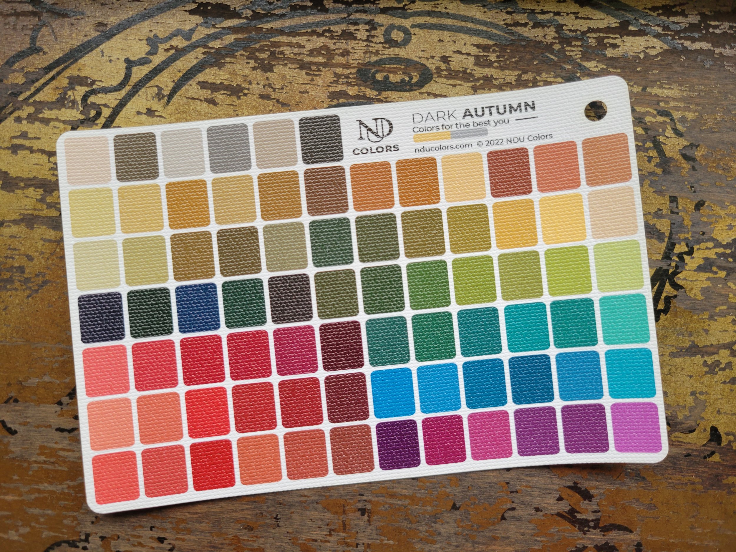
First, let’s explore their technical parameters:

The True seasons are the “primary colors” of PCA. While the seasons exist on a spectrum, the True seasons combine in different ways to form the Neutral seasons (Lights, Brights, Softs, and Darks).

True Autumn is one of the two true warm seasons. The colors are rich and rustic, bringing to mind spice markets and fallen leaves. True Autumn colors are more matte or “dry” in appearance than the juicy shades of the other true warm season, True Spring. They are also darker and more muted. 

Dark Autumn is a Warm-Neutral season. Dark Autumn takes its base from True Autumn, with a dash of True Winter’s electric coolness. Dark Autumn’s colors are are still obviously autumnal, but their darkness and winter influence lends them an intense and burnished glow.

Summer pastels and spring brights are not a friend to either of these seasons. They can look chalky, dusty, childish, or ungrounded on the autumn face and body. Likewise, the icy sharpness of winter can look hard and severe.

Aside from temperature, one difference between these two seasons is that the Dark Autumn palette is slightly higher in contrast than True Autumn, with more distance between the lightest and coolest colors in the palette. 

What happens when a True Autumn wears Dark Autumn colors?

A True Autumn wearing full-on Dark Autumn colors, particularly in makeup, may find her skin looking more pale, blue, or gray than it really is. Dark Autumn’s increased coolness can be harsh on the warmer True Autumn, manifesting in darker under-eye circles, or drier-looking skin. Eye color can look slightly faded. A True Autumn wearing Dark Autumn may find that she looks more severe or tired than her baseline.

What happens when a Dark Autumn wears True Autumn colors?

A Dark Autumn wearing full-on True Autumn clothing or makeup may find that her skin looks more sallow or orange than it really is. Eye makeup that’s too warm can make the eyes look red or watery, even ill, and lipstick that’s too warm can read as distinctly orange. A Dark Autumn wearing True Autumn may find that she looks slightly dusty or out of focus, not as vibrant as her baseline.

How do these two autumns wear their makeup?

All three autumn seasons are flattered by both matte and metallic effects, to varying degrees. Autumns will want to avoid overly-dewy looks, but makeup doesn’t have to be the mattest of matte across the entire face to be effective. Satin lipsticks and cream finishes are perfectly fine, though autumns will usually want to avoid heavily lacquered or vinyl-like textures, which can look slippery, formless, or even greasy on the autumn face. Where autumns really shine is in contrast of textures and light - such as a matte skin finish paired with a metallic eyeshadow or gleaming bronzer.

True Autumn is flattered by warm, medium-contrast makeup. Eye makeup is easy for this season, where palettes and singles in seasonally-appropriate colors abound. Take a look at Too Faced Natural Eyes or MAC Brule, Cork, and Wooodwinked. Eyeliners can be brown or bronze, like Clinique Roast Coffee or Hourglass Bronze, or even a lustered green like Urban Decay Stash. For cheeks, look for shades of rosy bronze, like Lancôme Shimmer Mocha Havana or NARS Lovejoy. For a more vibrant coral red, try 12 Blueprints Tiger Lily. For lipstick, you’ll find words like carnelian, chili, and cinnamon. Try Moira Beauty Drop the Beat, Merit Cara Cara, Glossier Trench, and MAC Brick O La.

Dark Autumn is flattered by warm, medium-contrast makeup, but it will veer cooler and darker than True Autumn. An individual Dark Autumn can still go too dark for comfort in makeup, so make sure you’re assessing all cosmetics within the context of your individual coloring. Like True Autumn, the world is your oyster when it comes to eyeshadow. Take a look at Maybelline Chai Latte, or the Natasha Denona Mini Nude palette. For singles, try Anastasia Beverly Hills in Vermeer, Warm Taupe, and Glisten. For eyeliner, metallics can be great, like Stila Lionfish and Urban Decay Stash, or a simple matte brown like Revlon Brown. For cheeks, look for scorched coral and warm burgundy, like NARS Taos, Moira Beauty I Need You, or Maybelline Deep Wine. For lipsticks, try Clarins Spicy Cinnamon, Bobbi Brown Cassis, and Revlon Wine With Everything (cream version).

Can these two seasons “cheat” with some of the same colors?

Honestly, yes. I find that all three autumns can borrow from their nearest autumn neighbor fairly successfully, depending on the individual and the colors in question. In particular, olive and brown shades tend to be very forgiving across all three autumns. But as always, be careful that you aren’t buying other seasons’ colors so much that you’re accidentally creating a seasonally-fractured wardrobe. Clothing for all three autumns is easy to find, so you should be able to build a seasonally-cohesive wardrobe without much fuss.

In makeup, these seasons share many eyeshadow and eyeliner colors well, as well as some bronzers and blushes. Lipstick colors have perhaps the least crossover, though there are exceptions, like Clinique Chunkiest Chili.

One last thing to note about these two seasons is that they can both wear brighter colors than one might expect. Autumn is muted, but autumn is also rich, like golden hour - not faded or powdery. Even Soft Autumn, the most muted autumn, is rich and vibrant in its own right.

If you’d like to explore these two seasons further, check out my Pinterest boards:

Making Practical Accessories Count


My favorite accessorizing tip is very simple, and it has nothing to do with coordinating earrings and necklaces, or watching videos of different ways to tie a scarf.

Instead, it’s this:

Make your practical, daily accessories interesting ones, and you’ll have less work to do when it comes to the rest of your outfit.

Case in point? Shoes. You’re already wearing shoes every time you leave your house. So instead of wearing black or brown ballet flats, what about wearing an accent color? Springs and autumns will benefit from just about any color in their personal rainbow, while winters and summers often tend to prefer a more neutral shoe. In that case, a color you wear frequently on your top half can become a pseudo-neutral in the context of shoes, like dusky rose for Soft Summer, or cobalt blue for True Winter.

If you prefer a neutral-colored shoe, you can increase the excitement factor with textures, patterns, and even hardware. Look for a faux snakeskin ballet flat, a floral-printed sneaker, a herringbone pump, or a boot with a decorative buckle. Ask yourself what excites you in a shoe shape. Is it a clog? Ankle booties? Peep-toe heels? Thigh-high boots? Doc Martens? Flat sneakers? Your shoes are just as much of an opportunity to infuse your wardrobe with your personal style as your dresses and earrings are. 

You’re probably also carrying some kind of bag when you leave the house. Whether it’s a structured tote big enough for your laptop, or a little crossbody bag for running errands, a well-chosen bag can easily become a signature piece in your wardrobe - or even the primary focal point of your outfits. 

Color is a simple way to make your bag more interesting, especially if you’re typically a neutral lover when it comes to clothing. Bags can be a great place to seek colors that you either don’t want to wear right next to your face (for many women, this is yellow), or colors that are difficult to find in clothing. There’s a surprising amount of color variety available in bags.

If you prefer a neutral bag, try pushing the envelope. If you’re a winter, must your bag be black? A crisp graphite gray can be a better choice. If you’re an autumn, all kinds of brown are easy, but a warm green-gray can be an exceptional alternative. For springs, your seasonal version of buttercream can look fresh and light, even grounding, among your colorful clothing. And for summers, look beyond classic navy to oyster or taupe. If you have a small scarf, you can knot it to your neutral bag when you’re in the mood for an accent color, and remove it when you’re not.

You can look for a bag in an intriguing shape, or with interest-adding hardware like zippers or grommets. Tassels, embroidery, whipstitching, or a chain strap can elevate a bag (especially a neutral one) into something more than the sum of its parts.

Frequently-repeated pieces like shoes and bags are excellent places to invest in your wardrobe, because their overall cost-per-wear can work out to be very little. That doesn’t mean you need to run out and buy a designer bag, but if you’re someone who likes to carry the same bag day-in and day-out, it can be worth spending a little more. And for shoes, make sure they are also comfy!

This trick can be expanded to all kinds of daily accessories, whether you’re wearing them on your body or simply holding them in your hands.

Here are some ideas:

  • Watches and watch bands

  • Glasses

  • Phone cases and phone grips

  • Headbands, hair barrettes, and scrunchies

  • Reusable drink tumblers

  • Wallets

  • Notebooks and planners

When both your shoes and your bag feel special, it’s easy to look polished, even on a quick trip to the grocery store. On a busy day, the rest of your outfit might be blue jeans and a neutral sweater, but your no-brainer daily accessories are doing the heavy lifting for you. Add some signature jewelry pieces you can wear on autopilot, and you’re well on your way to looking more exciting, without having to put in any extra thought when you get dressed.

How to Shop Effectively on Clothing Resale Sites


Over the past several years, my local thrift stores have become less exciting. The amazing pieces are snapped up quickly, the racks are overstuffed with damaged or poor quality items, and the prices have gone up. Some Goodwill stores have even removed their dressing rooms! My local mall has never offered the variety of colors and styles that I found in thrift stores (not to mention the low prices), so these developments have saddened me greatly. I still pop in to thrift stores from time to time, but I’ve shifted a lot of my secondhand shopping to online resale sites. 

Different resale sites have different shipping policies and structures. Some operate on consignment, while others are made up of individual sellers. Generally speaking, these sites are going to be more expensive than your local thrift store, but there are still great bargains to be had. I sometimes think of the higher prices as a convenience fee for not wading through the depths of my local Goodwill.

The Practical:

  1. Ask for measurements (and know your own). Many sellers on sites like Poshmark list clothing measurements in their listings. But if they haven’t, you can always ask! Usually, people are happy to give them. Just knowing your inseam for pants and your ideal pit-to-pit width for tops can drastically cut down on the amount of things you order that don’t fit you. I pretty much always ask for measurements when shopping resale, and I rarely buy anything without seeing the measurements first. This practice has saved me from a lot of ill-fitting purchases.

  2. Be critical about photos. I learned the hard way that on sites like Poshmark, there’s no rule about portraying an item’s color even remotely accurately. Sellers can filter their photos to their heart’s content. I look for photos that are taken in clear, neutral lighting, without funny casts or colors that seem artificially sharp or intense. I also appreciate when a seller has described the color in their listing description. If the item is from a known brand, I google to see what the item really looks like under different lighting conditions.

  3. Make offers - and don’t forget about shipping costs. On sites like ThredUp, you can get free shipping by bundling your items into one cart. On sites like Poshmark, eBay, or Mercari, you’re unfortunately paying shipping for each individual item. Keep this in mind when making offers! An item might be listed for $10, but in many cases shipping will take you closer to $20. Many sellers cross-list their items on different sites, so I usually do a quick check to see if I can get the same item for less on a different platform. Don’t forget to make offers! Many sellers will accept a lower price just to get the item out of their house.

The Philosophical:

  1. Don’t get sucked into the hunt. Just because clothes and accessories on these sites are cheaper than retail doesn’t mean they’re a good deal, or that your purchases don’t matter. It’s easy to get carried away and realize that you’ve spent $150 on random items. I try not to get on resale sites unless I already have an idea what I’m looking for, even if that’s just a specific color. Then I hit “like” or put items into my cart and leave them there for a few days. At that point, I’ll have a better idea of whether the item is a true need/desire, or just a passing impulse. As a bonus, many sellers will go ahead and make you a lower offer when you’ve liked something or added it to your cart.

  2. Filter purchases through the lens of your ideal style. Just because something’s cheap doesn’t mean it’s a good fit for you or your wardrobe. Maybe that dress is the absolute perfect color, but you already know it’s not a good cut for you. Maybe that sweater is your ideal silhouette, but the color is one you never like wearing. Maybe you found a purse in the perfect shape and color but you know the size is going to be impractical for you. Just like in thrift stores, it can be easy to justify things you wouldn’t normally buy on the basis of them being a “good deal.” But if it isn’t right for you, it’s not a good deal, even if it’s free. Ask yourself what you’re going to wear those new shoes with and if you really need a new winter hat.

  3. Use resale sites for inspiration. I use resale sites for ideas just as much as for actual shopping. I often save things that I know I’m not going to buy, because I want to remember to keep an eye out for something similar that will work better for me. Buying the first thing that inspires you isn’t always the greatest idea. Be patient and wait for exactly the right item.

Bonus:

  1. Resell items that don’t work for you. One of the worst things you can do is buy loads of items from resale sites, find that they don’t fit or aren’t the color you thought, and shove them into the back of your closet. List these items yourself to get some of your money back!

Want to work with me? My fall books are open for color analysis, image analysis, and style coaching packages. You can explore all of them here!

Dressing For Autumn When You Aren't an Autumn


Every year when the weather turns, I see so many inquiries from women who are Brights, Lights, True Spring, and True Summer wondering what they should wear in the autumn and winter months. 

The simplest answer is that you should continue wearing the colors that suit you best. Light Summers shouldn’t suddenly start wearing warm mustard, and Bright Springs shouldn’t start wearing dark burgundy. While you might look appropriate for the season of the year, you will not look your best, any more than you would look your best wearing mustard or burgundy in July. 

That said, I know this pull toward cozy, autumn colors is a strong one for many women. You may want to carefully bend the boundaries of your season, or choose colors within your season that feel more autumnal to you.

Here are some ways to tweak your season toward its warmer/darker shades, construct outfits to feel more autumnal, and even indulge in autumn colors outside of your style.

For Clothing/Makeup:

If you’re a Bright Winter, you’ll want to look for deep emerald, berry purple, and rich navy during this time. If you can find Bright Winter’s cool espresso brown, it’s an excellent choice. You might prefer red lipstick over pink or fuchsia.

If you’re a Bright Spring, you’ll want to look for mango yellow, clear root beer brown, rich coral, and bright navy. For lipstick, you might like orange-toned coral and red more than pink.

If you’re a True Spring, this transition is a little easier due to your inherent warmth. Look for warm sandy beige, coconut brown, golden yellow, and juicy red-orange. Your usual orange-red lipstick will work just fine - on you, no one will notice they aren’t autumn shades.

If you’re a Light Spring, you might like more neutrals during this time of year, like sandy taupe and warm light brown, with accents of fresh golden green and papaya. Resist the urge to choose browner lipsticks, which will look muddy. Instead, go for cantaloupe or sheer gold.

If you’re a Light Summer, things get tricky due to your cooler palette. Look for your soft light aubergine, blue gray, and navy, with watermelon red and raspberry pink as accent colors. For lipstick, you might prefer a warmer coral-rose during this season.

If you’re a True Summer, neutrals and darker shades will help make up for the distinct lack of warmth in your palette. Look for your denim blue, soft grape, and red berry. Gray-taupe and cool cocoa brown are great neutrals. For lipstick, choose the darker shades of raspberry and rose in your palette.

For Outfits:

One of the hallmarks of autumn colors in general is that they are not very high contrast in relationship to one another. When putting autumn outfits together, aim for a more layered or blended look by combining different shades of the same color. You can also choose to wear predominantly your season’s neutrals, with a pop of seasonally-appropriate color. For a Light Spring, this might be a warm ivory sweater paired with a golden khaki skirt and boots, and a cantaloupe purse. 

Earthy detailing can also add an autumnal feel to your clothing and accessories. Fringe on a scarf, patterned buttons, and polymer clay or leather earrings are great for this. Textured fabrics like cable knit (and sweater knits in general), ribbing, and corduroy feel cozy regardless of color. Grommets, whipstitching, tassels, embroidery, braiding, and other design motifs can add texture and visual interest to your seasonal colors.

For Beyond:

Nail polish can be a cheap and fun way to step outside of your season without investing serious money or storage space in clothing that doesn’t work for your coloring. If you usually get your nails professionally done, you won’t even get stuck with the bottle. 

One of my favorite ways to indulge a craving for colors outside of my season is to acquire them in a mug, a notebook, a phone case, or a throw blanket - something I’ll be in contact with on a daily basis, but not wearing on my body. After all, I’m not usually staring at my own outfit or makeup all day. This way you get all the enjoyment of looking at the colors, but you won’t suffer the visual side effects.

Want to work with me? My fall books are open for color analysis, image analysis, and style coaching packages. You can explore all of them here!