How to Work With a Soul Board: Part Two

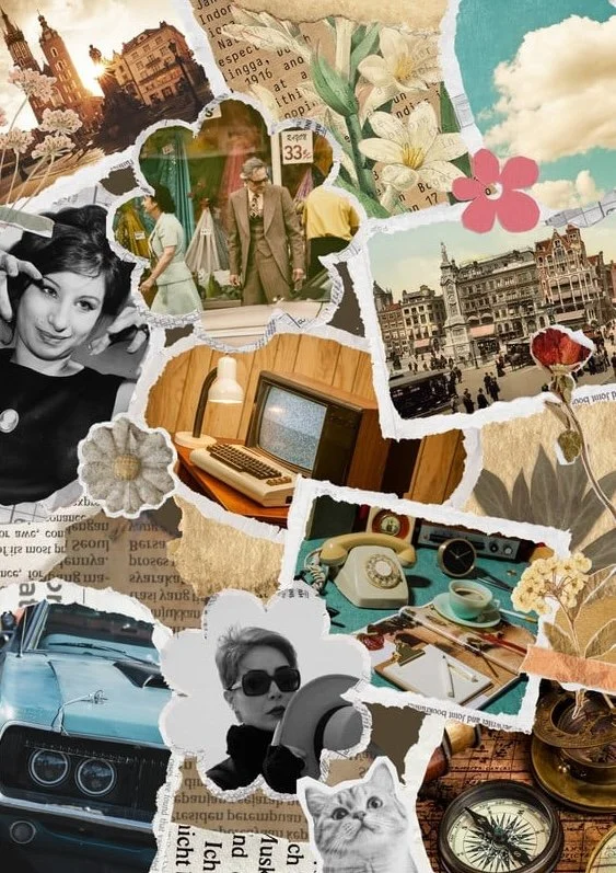
How to Analyze Your Soul Board

Look at the overall color palette on your board. Are the colors light, bright, soft, dark, cool, or warm? Look at the textures on your board. Are they soft, hard, rough, slippery, plush, flat? What about the shapes on your board? Are they curved, sharp, large, small, rounded, square? Look at the design motifs of your board. What types of images have you repeated?

Think about how these details can be translated to your wardrobe, and how they can work alongside your season and archetype (if you know them). This exercise requires creativity, but creativity is a muscle. Practice it. You don’t have to have all the answers right away! Style is never set in stone, and neither is your board. Be open to possibilities.

For example, if you have saved lots of fairy tale imagery to your board (guilty as charged), think about what it is about that imagery that calls to you. I realized myself that I’m personally drawn to “fairy tale princess” silhouettes in clothing: slightly fuller skirts, emphasized waists, soft textures, minimal but quality accessories, and a dreamy color palette. There’s a whimsical (but not twee or overly “cute”) quality to a lot of fairy tale imagery that appeals to me, and I’m often happiest with outfits that reference that whimsical quality. 

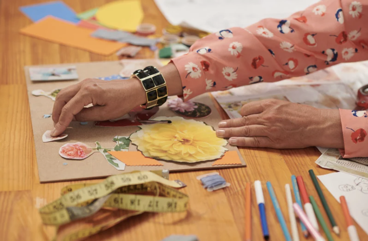
Examples From Soul Board Work With My Clients

One client’s board was filled with sweet, small-scale details like buttons, small floral embroidery, knitting projects, patchwork quilts, and shabby chic interiors. Her board felt largely “indoor” with a focus on hand-crafts. The color palette of her board was more or less a Soft Autumn palette, with some touches of brighter True and Light Summer colors. We used her board to identify that she liked clothing with soft textures and unique hand-crafted details, like crocheted cardigans, embroidered hems and necklines, and cute quirky buttons. She really enjoyed layering pieces, like a fuzzy sweater with a wool skirt and stockings. Whimsy was important to her sense of self-expression. Sometimes she would knit something herself, or swap plain buttons for buttons that had more individual flair.

Another client’s board was expansive and elongated, with images of rock formations, desert skies, waterfalls, looming trees, and lush foliage. Her board felt largely “outdoors” with lots of open space punctuated by large-scale detailing. Her color palette was already pretty dialed-in, comprised of oatmeal, deep russet, olive green, and dark brown. This client was tall and generally preferred longer lines in clothing, which was reflected in her soul board. We worked on steering her wardrobe toward longer-lined pieces like jumpsuits, trousers, and boyfriend-style blazers, but also some slouchier linen pieces that felt second-skin. She had an organic sensibility punctuated with moments of drama, like pairing slouchy linen pants and a button-down, half-tucked, with rich gold earrings and bangles.

Can I Have a Personal Style Board, Too?

Absolutely! After you’ve worked with your soul board for a while, I recommend creating a designated personal style board. This board will be informed by your soul board, but the images you choose will be more focused and specific. Here is where you think about stuff like: Is my real-life self actually interested in wearing dresses? What colors would I actually purchase and wear? Am I more into monochromatic color schemes, wearing a pop of color, or wearing lots of color at once?

I’ve chosen to keep my personal style board private to ensure my authentic expression. You may choose to do the same, or you may want your board to be public. Whatever works for you is fine! 

My personal style board is limited to my real-life color palette and archetype. This is the board where I pin images of clothing and accessories I would actually buy and wear (even if they are not available to actually purchase), hairstyles that are realistic for my hair type, and makeup looks that suit my coloring and facial features. I do include some mood-based images, especially if they reference my style catchphrase and personal vibe, but they need to feel seamless with my wardrobe and style concept. If I wouldn’t really wear an item, it’s not allowed on my style board, even if I find it inspiring. 

What if My Soul Board and Season/Archetype Conflict?

Let’s say your board is full of small-scale, cute detailing in pastel colors…but you are a Dark Winter Dramatic Natural.

Let’s also say you love cats, and you’ve pinned a lot of cute house cats onto your board. Take that cute, approachable animal and just make it larger scale to suit your physicality. Maybe you find a sweater at Anthropologie with a large-scale pattern of a house cat or even a leopard. Maybe you find a large drop earring shaped like a cat, or polymer clay earrings with a dramatic painting of a cat.

I believe that strategic disharmony can be very visually appealing. This takes care in terms of the exact colors you choose, but I can easily picture a pastel blue, pink, or purple accessory, like a purse or necklace, paired with its Dark Winter equivalent, or a contrasting Dark Winter shade. Think: an inky blue sweater worn with a Light Summer mid-tone blue purse for a pop of controlled disharmony. Think: a Dark Winter emerald green dress paired with larger-scale pastel coral or pink earrings. 

In this scenario, you may enjoy veering toward the lighter and midrange colors in your palette for the bulk of your wardrobe, and sprinkling in the darker colors as accents so that your overall look isn’t so dark, but is still seasonally appropriate. 

Your Soul Board is a living document. Let it change, flow, and be informed by your changing preferences. There are no mistakes!

Want to work with me on your Soul Board?

How to Work With a Soul Board: Part One

If you listened to my first guest appearance on the Chrysalis Color podcast, you probably know all about my Soul Board method. But if you don’t, I’m going to tell you exactly what it is, how I use this method to work with my clients, and how you can start one yourself.

When I got serious about improving my personal style, I noticed that a lot of people had personal style boards on Pinterest, where they would save outfits, makeup, and style concepts that appealed to them personally. So I created a style board, too, choosing images based on my color palette and my physical archetype. And while my board looked great, I often struggled to translate these specific images to my real-life wardrobe.

Simultaneously, I was saving a lot of images to a separate board without thinking about style at all. These images were all over the map: classic art, architecture, jewelry, vintage movie stills, landscapes, fabrics. What they all had in common is that they were beautiful to me. They spoke to my heart and made me feel emotional, a sense of longing. I didn’t worry about cohesion when pinning images, but over time the board became pretty naturally harmonious with itself.

I don’t remember how or why, but I started using this board to reverse-engineer my personal style. I noticed a lot of recurring motifs in the images I was choosing: lush flowing fabrics, mermaids, women with long hair, water in all its forms, art nouveau, forests and flowers galore, knits, embroidery. I began to look for these details in clothing and accessories, keeping my palette and archetype’s guidelines in mind. Almost as if like magic, my personal style bloomed. I had it dialed in. The Soul Board was born.

When I started offering personal style coaching, the Soul Board method was at the heart of my work. If a client really isn’t interested in this element of coaching, of course I don’t force them to partake, but most of my clients are really drawn to this concept after years of saving style ideas that didn’t take shape. It’s always amazing to me what can be gleaned from someone’s Soul Board. Everything from perfume notes, patterns, clothing silhouettes, accessories, textures, and personal vibe can be reverse-engineered from the Soul Board.

Personal Color Analysis and Personal Style Analysis are such important tools! But tools are meaningless if you don’t use them - and if you don’t find a way to resonate with them. Not everyone loves their season or archetype right off the bat. Maybe you were draped as a Light Summer but you love dark and moody vibes. Maybe you’re a Dramatic Natural but you love cute little accessories. I believe there is always a way to combine what speaks to your heart with what suits your physicality, and the Soul Board is the best way I’ve found to dig into it.

The beauty of the Soul Board is that you never have to start over (unless you really want to). Pinterest is littered with abandoned style boards, but the Soul Board is flexible. If you used to love light and floaty color schemes, but now you’re into all things Victorian Gothic, it’s no problem. Maybe your preferred color palette has always been cohesive, but the shapes and design details you prefer are different now. You can just keep collaging new images on top. Or if your style has diverged drastically enough, you may choose to start a brand new, wide-open soul board and keep the old one as a reference point for who you were then. I chose to do this after about 10 years of working with one soul board, and I love seeing the evolution and similarities between the two.

So How Do I Start One?

Create a new board. If you feel hampered by the idea that others may see your board, go ahead and make it private!

If you can, try to ignore your color palette and archetype completely, unless they already resonate with you on a heart level. Look for images of landscapes, rooms, foods, fabrics, colors, moods, and other things that are inspiring to you and spark your imagination. Think of movie scenes and book covers that speak to you. If there any quotes that really jump out at you, add them! Your soul board can include images of clothing, but try to stay away from more sterile images like flat lay stock photos. Feel free to pin heart-stopping pieces, beautifully-styled shoots, and other images involving clothing that really speak to you.

Your Soul Board is not the place to store aspirational images of people you wish you looked like, body types you wish you had, or hyper-specific clothing items you want to buy. Your Soul Board is about your deepest desires and soul stirrings. Look for images that make you feel authentic, inspired, and emotional. Let your “fantasy self” show up here in all their glory. Our fantasy selves can be important tools in helping us figure out what we really want from life and style. Try not to edit your board too much later, unless you save something that you decide you don’t really like after all.

If you’ve been on Pinterest for a while, your Home page may have some great suggestions for you to get started with. If you’re new to Pinterest, try searching for things you already know you like. They can be anything - candles, desert landscapes, modern art, bookshelves, panthers, charcuterie plates. You can also try browsing color analysis mood boards, because there’s usually a wide variety of subjects represented.

Then What?

Keep collecting images to your board. Sign into Pinterest every day and see what your Home page suggests to you. Scroll for a few minutes while you brush your teeth or drink your morning coffee. After a while, your board will take shape. Then you can take a step back and review your board with a curious eye.

In Part Two next week, I’ll describe how to break down your soul board into specific style concepts.

Want to work with me?

PCA Training Course Now Available in Louisville, KY

I'm thrilled to announce that I am now certified as a Your Natural Design PCA instructor!

I trained in the SciArt method with Terry Wildfong of Your Natural Design in 2014, and I’ve been practicing color analysis ever since. I have now completed my PCA instructor training with Terry Wildfong, and I’m accepting PCA students of my own!

Teaching is my favorite part of my work as both a color analyst and a style coach. I love seeing that moment where everything “clicks” and I’m so excited to train a new generation of color analysts.

You can find more information about my PCA training course here.

Color Analysis and Common Food Keywords

Last week, I made apple butter - an October tradition that fills my kitchen with steam and the rumble of my water bath canner.  As I was cooking the apples down, transforming them into their smooth and spiced glory, I started thinking about food keywords for the twelve seasons.


Food keywords are common in the names of clothing and cosmetics, and can provide valuable clues about which season a lipstick or sweater might be - as well as which seasons they might not be.

A color such as “apricot” could be any spring, or any autumn, and potentially even Light Summer, depending on the exact hue. But it’s unlikely to be any winter, Soft Summer, or True Summer. It’s difficult to picture a juicy apricot in a smoky Soft Summer forest. Why is the apricot there? Why is it so lurid and orange among these soft blues and greens? Similarly, it’s difficult to picture a soft and tawny apricot among the bright maraschino cherries and sapphire jewelry of Bright Winter.

Food keywords can refer to common fruits and vegetables, as well as edible flowers, spices, and herbs. They can also refer to specific dishes or beverages, like sangria or buttercream.

Spring and autumn colors are more generously referenced by food words, whereas winter and summer colors are often more easily referenced by flowers or landscape words.

Spring colors are more likely to be described by foods which are juicy and sweet, like fresh tropical fruits or dairy products. Autumn colors are more likely to be described by foods which feel more dry and “earthy,” such as spices, nuts, grains, and root vegetables.

Here are some food keywords I’ve collected for all four parent seasons. You may notice some overlapping words on these lists, as many foods come in a variation of hues. No matter how safe a keyword seems, swatching is still paramount!

Common Food Keywords For Winters:

Apple, Aubergine, Beet, Berry, Blackberry, Blackcurrant, Caviar, Cherry, Citron, Coconut, Coffee, Coulis, Currant, Cranberry, Dragonfruit, Eggplant, Elderberry, Espresso, Grape, Hibiscus, Jam, Juniper, Lemon, Loganberry, Maraschino, Marshmallow, Matcha, Merlot, Mulberry, Plum, Pomegranate, Raspberry, Redcurrant, Red Velvet, Sangria, Strawberry, Sugar, Violet, Wasabi, Wine

Common Food Keywords for Springs:

Almond, Apple, Apricot, Banana, Bergamot, Butter, Buttercream, Buttermilk, Cantaloupe, Cashew, Champagne, Clementine, Coconut, Cream, Cucumber, Daiquiri, Dill, Fruit Punch, Ginger, Grapefruit, Guava, Hibiscus, Honeycomb, Honeydew, Kiwi, Latte, Lemonade, Lime, Lychee, Mandarin, Mango, Marshmallow, Melon, Milk Chocolate, Nectar, Orange, Oyster, Papaya, Peach, Pear, Persimmon, Pineapple, Praline, Root Beer, Salmon, Shrimp, Strawberry, Sugar, Tangerine, Tapioca, Tomato, Vanilla, Violet, Watermelon, Yogurt

Common Food Keywords for Summers:

Bay Leaf, Berry, Blueberry, Buttercream, Champagne, Cocoa, Cotton Candy, Cream, Eggshell, Fig, Juniper, Lavender, Lemonade, Marsala, Marshmallow, Meringue, Milk, Mint, Mulberry, Mushroom, Oregano, Oyster, Peach (LSu only), Plum, Raisin, Raspberry, Rhubarb, Rice, Rose, Rosemary, Rosewater, Sage, Sagebrush, Strawberry, Watermelon, Yogurt

Common Food Keywords for Autumns:

Almond, Apricot, Aubergine, Blood Orange, Butter, Buttercream, Buttermilk, Butterscotch, Brown Sugar, Caramel, Cardamom, Cashew, Cayenne, Champagne, Chestnut, Chili, Chocolate, Cider, Cinnamon, Clove, Cocoa, Coffee, Cognac, Cornmeal, Cream, Date, Dijon, Dried Cherry, Eggplant, Eggshell, Espresso, Fig, Ginger, Gingerbread, Honey, Jalapeno, Latte, Licorice, Malt, Maple, Marigold, Marsala, Matcha, Mocha, Molasses, Mustard, Nutmeg, Oatmeal, Olive, Paprika, Parsnip, Pea, Peanut, Pear, Pecan, Pepper, Persimmon, Pistachio, Plum, Poblano, Praline, Pumpkin, Raisin, Rice, Rosemary, Russet, Saffron, Sage, Salmon, Sesame, Tahini, Tea, Turmeric, Vanilla, Walnut, Wasabi, Wheat, Whiskey, Wine

If reading this left you not only craving a snack but wanting to book your color analysis right away, you’re in luck! I have appointments available this weekend (October 28th and 29th) at my Louisville studio. You can book your session at the link below.