I believe that everyone is beautiful.
I used to scoff at people who said things like that. I was convinced it was a pat on the head from the true beauties of the world, who felt badly for the rest of us.
I had no idea that everyone's eyes were capable of glittering, the rind of the iris crisp and clear. Eye patterns? What's that? If you'd told me that an eye could contain spokes, webbing, or little stars, I'd have given you major side-eye. My awareness of eye color was limited to the information required for a driver's license: Blue, Green, Brown, maybe Hazel. I didn't know that an eye could resemble cracked aqua glass, or licorice nestled among moss.
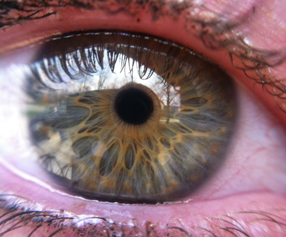
This is the eye of my lovely friend Emily. Stunning.
I didn't know that hair color like dishwater blonde or mousy brown were mirages. I've seen ho-hum hair gain subtle highlights with the change of a drape. Hair that appears coated with baby powder against one drape is freshly-washed with the next.
I grew up on a media diet of airbrushing and Photoshop. I had no idea that rosacea, vitiligo, freckles, birthmarks, crow's feet, and other "imperfections" were no more imperfections than the texture caused by hammering silver. I'd always found crow's feet particularly adorable, but in my mind they were something I found appealing in spite of their flawed nature.
I bought into my generation's truths about beauty and measured my worth against them.
In 7th grade a boy told me I had a big nose, so I spent over a decade assuming I'd get a nose job one day. I had a big gap between my front teeth, so I stopped smiling with my mouth open. I decided my breasts were too small, so I decided to wear push-up bras forever. I had naturally curly hair, so I woke up early every day to straighten it before school.
My daughter Simone is five. She's funny, empathetic, terrifyingly smart, and very pretty.
She has a gap between her teeth just like I do, and I think it's precious. She tells me that she loves the gap between her teeth because it makes her look like me.
At a bookstore last weekend, Simone was coloring at a table with another little girl. I heard the little girl ask Simone if she had lost a tooth. Without looking up from her picture, Simone said, "No, I just have a space between my teeth." The little girl passed her the sequins.
When you're sitting in my studio, I'm not interested in changing the architecture of your face, giving you paler skin or an artificial tan, fitting you into a fashion mold, or insisting that you need makeup to look your best. Makeup can be fun, but it's not necessary.
I believe that everyone is beautiful. Sometimes we just need help seeing it.

